Gather
BRANDING, BOOK DESIGN, FURNITURE DESIGN
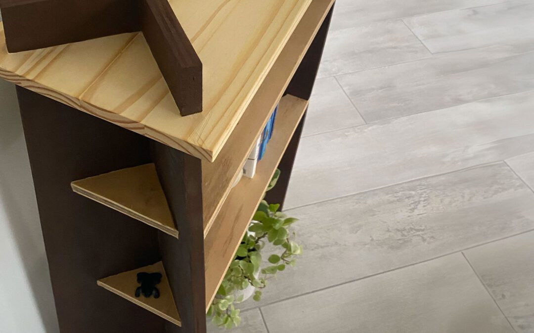
This collection celebrates the quiet significance of the dining table as the place where everyday life unfolds. By honoring the simple moments shared over meals, conversation, and presence, the work encourages a more intentional appreciation of connection around a dining table. It recognizes the dining table not just as furniture, but as a gathering point where ordinary experiences gain meaning through the people who share them.


Business Model
This package consists of recipe cards and a catalogue showcasing the furniture through a more exploratory lens of cut paper. Woven throughout the catalogue is the story of our main character, Leah, meeting her boyfriend, Nick’s, family for the first time over a shared meal. This is one of two packages a subscriber receives each year, with each one showcasing its own visual world, carrying a distinct theme while staying true to the larger brand identity. The commercial intent is deliberately quiet here so that the furniture and the story are given room to speak. The catalogue is designed to be something worth sitting with, whether or not a purchase ever follows.


Brand System
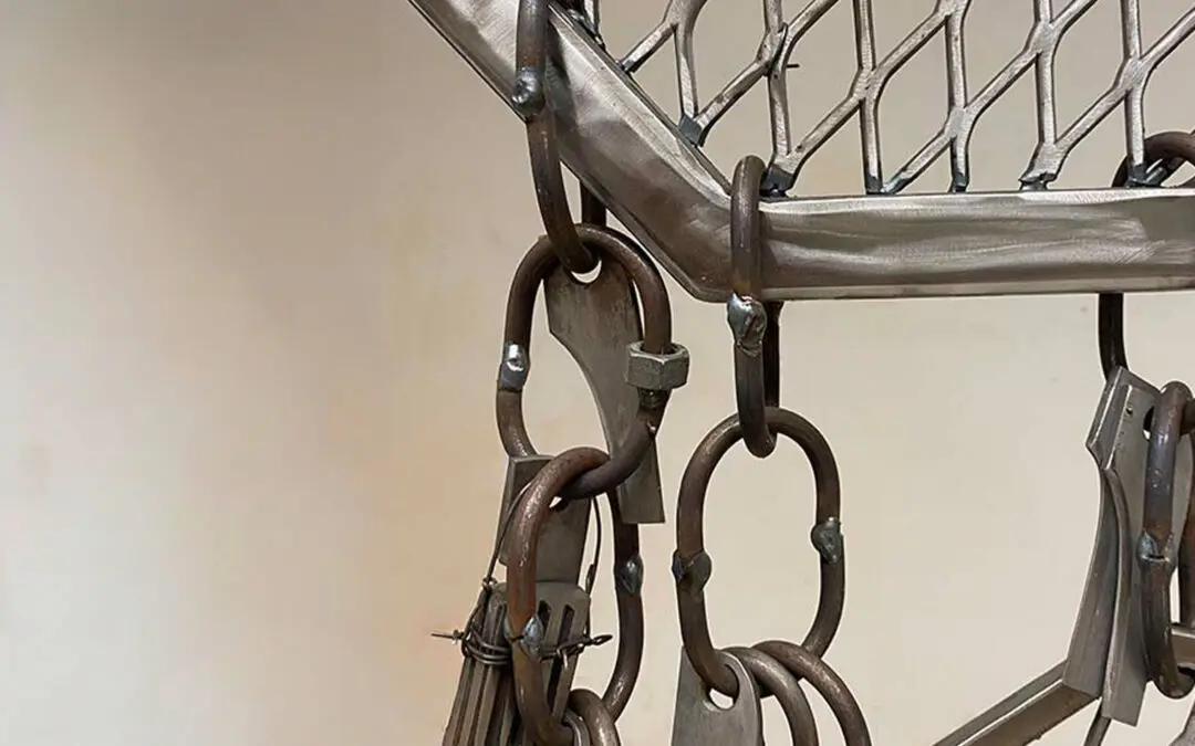
This collection begins with a system of motifs inspired by Italian tilework, plateware, and simplified French imperial forms. Each motif is constructed mathematically through grids and drafting lines, creating a visual language rooted in balance and structure. These forms repeat and recombine across the furniture, allowing individual pieces to connect into a unified whole and create a furniture collection designed using graphic principles.


Material Significance
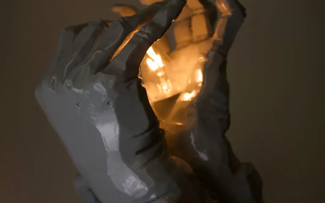
This catalogue is produced with highly textured paper to create a more tactile experience for the user and to echo the texture of the cut-paper imagery. Clear materials appear consistently throughout, suggesting openness and honesty. They reflect the idea that the dining table is a place where people are genuinely present with one another.


The Story
The story of Leah and Nick is highlighted on the four vellum pages woven throughout the catalogue. Each part is paired with a technical, yet emotional, line drawing that gives form to the feeling of that moment. Each diagram is meticulously designed to highlight what is on the page underneath, whether it is flipped on the right page or the left. The story is intentionally printed on one side of the vellum so that it is inverted when you first flip onto the page. It serves as a small invitation to pause, flip the page, and step a little further in.